Sirkle's Mobile Mastery: Navigating the Mobile-First Era

In the realm of digital evolution, the mobile device has emerged as the central instrument of online engagement. Sirkle, understanding the mobile-first imperative, takes the lead in crafting a Mobile Mastery experience. This blog delves into how Sirkle seamlessly adapts to the mobile-first trend, providing businesses with the tools to create websites optimized for the handheld era.

The Mobile-First Imperative
As the digital landscape continues to shift, more users access websites through mobile devices than ever before. Recognizing this shift, Sirkle positions itself at the forefront, championing the cause of mobile-first design.
Sirkle's Mobile Mastery Features
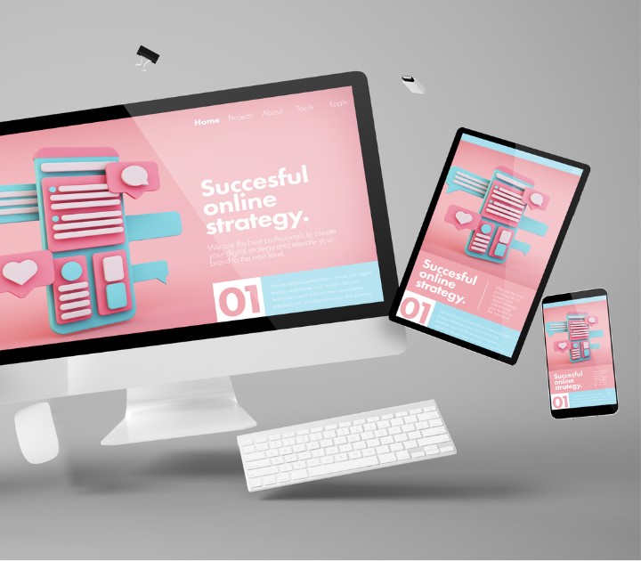
1. Responsive Design
Sirkle's websites are designed with responsiveness at their core. Whether viewed on a desktop, laptop, tablet, or smartphone, your website adapts and retains its visual appeal and functionality.
2. Mobile-Optimized Templates
Sirkle offers a variety of mobile-optimized templates, ensuring that your website looks sleek and functions seamlessly on screens of all sizes.

3. Touch-Friendly Navigation
Navigating a website on a mobile device requires a touch-friendly approach. Sirkle's touch-friendly navigation elements enhance the user experience, making interaction smooth and intuitive.
4. Quick Loading Speed
Mobile users demand speed. Sirkle's optimized websites load quickly on mobile devices, providing instant access to information without frustrating delays.
5. Mobile Editing Capabilities
Business doesn't wait for you to sit at a desk. With Sirkle's mobile editing capabilities, you can manage your website, make updates, and engage with your audience on the go.

The Sirkle Advantage in the Mobile-First Era
1. Wider Reach
Mobile optimization extends your reach to a broader audience, capturing users who predominantly browse and shop using their smartphones.
2. Enhanced User Experience
Sirkle ensures that mobile users have a seamless and enjoyable experience, reducing bounce rates and keeping visitors engaged.
3. SEO Friendliness
Google favors mobile-friendly websites. Sirkle's mobile mastery not only caters to users but also boosts your site's search engine ranking.
4. Adaptability to Trends
As mobile trends evolve, so does Sirkle. The platform stays current, ensuring that your website remains on the cutting edge of mobile design.

Crafting Success in the Palm of Your Hand
In the mobile-first era, success lies in the palm of your audience's hand. Craft success with Sirkle's Mobile Mastery, where websites are not just viewed but experienced on every device. Adapt, engage, and thrive in the mobile landscape with a website that reflects the excellence of Sirkle's mobile-first design philosophy.
- Share this Blog:


